A frosted, translucent glass effect is showing up on more and more modern websites — that’s Glassmorphism, one of the standout UI design trends in recent years. This article explains its defining traits and how to apply it effectively.
What Is Glassmorphism?
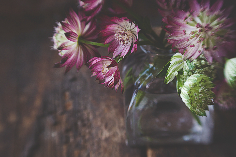
Glassmorphism is a design style that creates a frosted, translucent glass effect, letting part of the content behind an element show through, combined with a subtle blur effect and a soft glowing border.
Defining Traits of Glassmorphism
Background Blur
This is the core characteristic — it makes interface elements feel like they’re “floating” on a pane of frosted glass, letting the content or colors behind them show through faintly.
Light Transparency
Elements typically have some degree of transparency rather than a fully solid background, adding depth and a light, airy feel to the interface.
A Subtle Glowing Border
A thin, light-colored border usually wraps around content blocks, reinforcing the sense of an actual pane of glass with real thickness.
A Bright, Colorful Palette
Glassmorphism is often paired with a vibrant gradient background, which makes the blur effect pop and feel more eye-catching.
Why Is Glassmorphism So Popular?
This style delivers a modern, light, visually layered feel without requiring a lot of complex decorative detail — a great fit for design trends that favor minimalism without sacrificing visual impact.
Applying Glassmorphism in Website Design
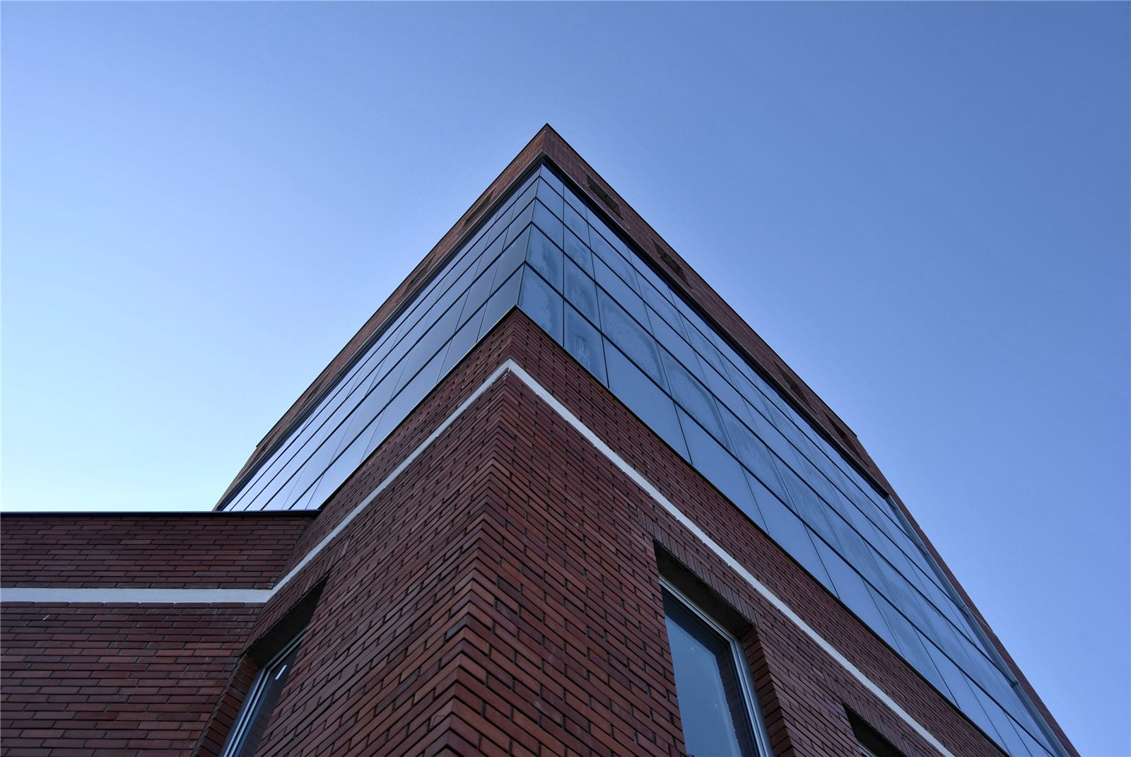
This style is often applied to elements like cards, navigation bars, modals, or login/signup forms, adding a visual highlight without cluttering the overall interface.
What to Keep in Mind When Using Glassmorphism
Keep Content Readable
Because of the transparency and blur, make sure text still has enough contrast to stay readable — don’t overuse the effect to the point where content becomes hard to read.
Consider Page Load Performance
The blur effect can affect rendering performance on lower-spec devices — test and optimize it to avoid slowing down page load times.
Don’t Overuse It Across the Whole Site
Glassmorphism works best as an accent for specific elements — applying it across the entire interface can throw off your site’s overall visual balance.
Understanding what glassmorphism is is the first step toward applying this knowledge correctly in practice rather than just knowing it in theory. A solid grasp of glassmorphism is the foundation for running an effective, sustainable design trend over time. That’s also why glassmorphism is a constant reference point in reputable UI design resources today.
As with any visual trend, restraint matters more than novelty — a handful of well-placed frosted-glass panels can feel premium, while overusing the effect across an entire layout quickly becomes visually noisy and can even hurt readability for users with visual impairments. Pairing it with strong color contrast and generous spacing keeps the look elegant rather than gimmicky.
Performance testing is worth a special mention: because this effect relies on real-time background blurring, it can quietly slow down page rendering on older phones and budget devices, so always check load times on a range of real hardware, not just a high-end development machine.
Used thoughtfully and tested on real devices, this trend can add genuine polish without sacrificing usability or speed.
Conclusion
Glassmorphism is a design trend that can give your website a modern, refined look when applied at the right scale and in the right context. If you’d like to bring the latest UI design trends to your website, contact our team for detailed guidance.
You may also want to explore Dark Mode websites and what a Progressive Web App is, as well as reference material from Google Search Central to better understand these concepts before implementation.