

A beautiful website without an effective CTA will struggle to convert visitors into real customers. This article explains what a CTA is and how to design one that grabs attention and drives action.
What Is a CTA?
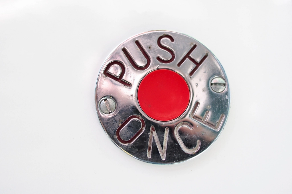
A CTA (Call to Action) is a button or link that prompts users to take a specific action — such as “Contact Us Now,” “Get a Quote,” or “Book a Consultation” — playing a key role in turning visitors into leads.
Why Is a CTA Important on a Website?
A CTA is the direct bridge between your website’s content and your business goals — without a clear CTA, visitors who are genuinely interested in your product or service may still leave without taking any action.
What Makes a CTA Effective?
1. Action-Oriented, Specific Language
Instead of generic words like “Submit” or “Learn More,” use specific, benefit-driven language such as “Get a Free Quote” or “Book Your Consultation Now.”
2. A Bold, Contrasting Color
A CTA button needs a color that stands out clearly against its surroundings to grab attention immediately, while still staying harmonious with your overall brand palette.
3. Smart Placement
CTAs should appear at strategic points — at the top of the page, after key benefit sections, and at the bottom — rather than being placed only once at the very end, which forces users to scroll too far.
4. Appropriate Size and Whitespace

A CTA button needs to be large enough to tap easily, especially on mobile devices, and should have enough surrounding whitespace so it doesn’t get lost among other elements.
5. A Sense of Urgency or Clear Value
Phrases like “Offer ends today” or “Free consultation” help push users to act immediately rather than put it off.
Where Should You Place CTAs on Your Website?
CTAs should appear in the homepage’s top banner, at the end of every blog post, at the bottom of service pages, and in a sticky navigation bar so they’re always visible no matter how far the user scrolls.
Common CTA Design Mistakes
A common mistake is using too many different CTAs on the same page, which scatters user attention, or giving the CTA a color too similar to other elements so users don’t realize it’s clickable.
Understanding what a CTA is is the first step toward applying this knowledge correctly in practice rather than just knowing it in theory. A solid grasp of CTAs is the foundation for running an effective, sustainable conversion strategy over time. That’s also why CTAs are a constant reference point in reputable design resources today.
Once you understand what is a CTA and how it fits into the customer journey, the next step is testing different wordings, colors, and placements to see what actually moves your specific audience to act. Even small changes — a shorter phrase, a warmer color, a shadow that makes the button pop — can meaningfully change conversion rates. Treat every CTA as a hypothesis to validate with real visitor data, not a one-time design decision you set and forget.
Beyond wording and color, placement plays a bigger role than most teams expect when answering what is a CTA that actually converts — a button above the fold performs very differently from the same button buried at the bottom of a long page, so testing position is just as important as testing copy.
Conclusion
A CTA may be small, but it has a major impact on your website’s overall conversion rate — it deserves careful design and thoughtful placement. If you need help optimizing your CTAs to boost conversions, contact our team for detailed support.
You may also want to explore what brand identity means and what a wireframe is, as well as reference material from Google Search Central to better understand these concepts before implementation.